Probably the most common error a photography newcomer can make (past me definitely included, as you might have read in our 1st ever blogpost) is completely disregarding light and solely focusing on the subject. In both portrait and erotic photography light can and should be used as a mood setter as well as physique enhancer. Curious as to what both mean? Well then read on below - and we’re going to show you how influential light is with examples from our own archive, colleagues’ and some stock photos for good measure as well.
Intro: “Ok, but why should I care?”
Since people’s most common interaction with photography nowadays comes in the form of a smartphone – we don’t care much about how we’re taking a photo - most of us open up the camera just to store a quick snapshot of what you’re seeing after all.
If you scroll through your camera feed you’ll probably quickly notice a pattern – there will be two types of photos:
- Taken outdoors in sunny weather, at sunrise or at sunset.
- Taken outdoors in bad weather, during overcast or indoors.
With the latter group being… well… noticeably worse in their appeal, regardless of their contents.
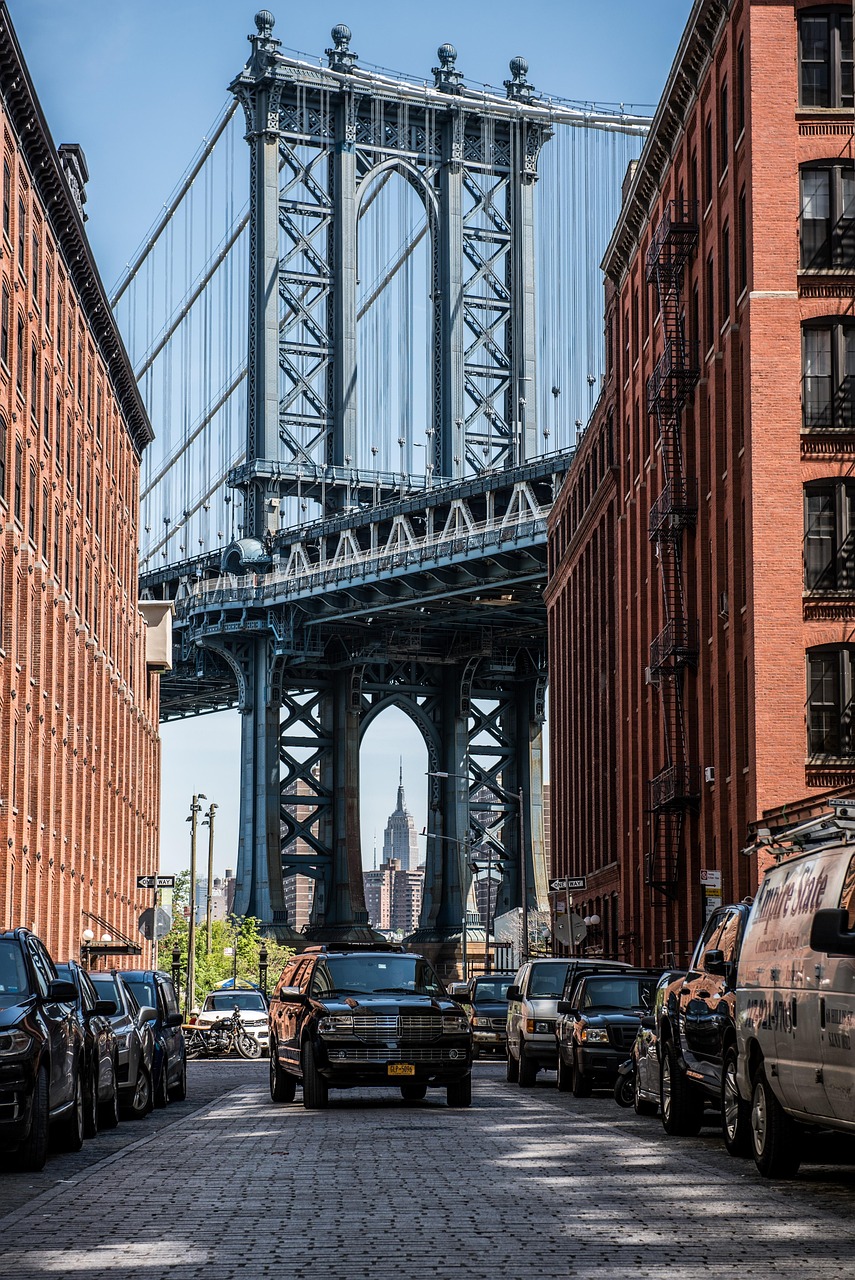
Want an exact example?Imagine you’re on a holiday in NY and come across that typical spot in Brooklyn where tourists on Washington Street take pictures of Manhattan Bridge. You go by there a couple of times throughout your trip and take a picture each time.
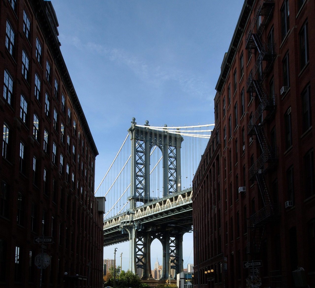
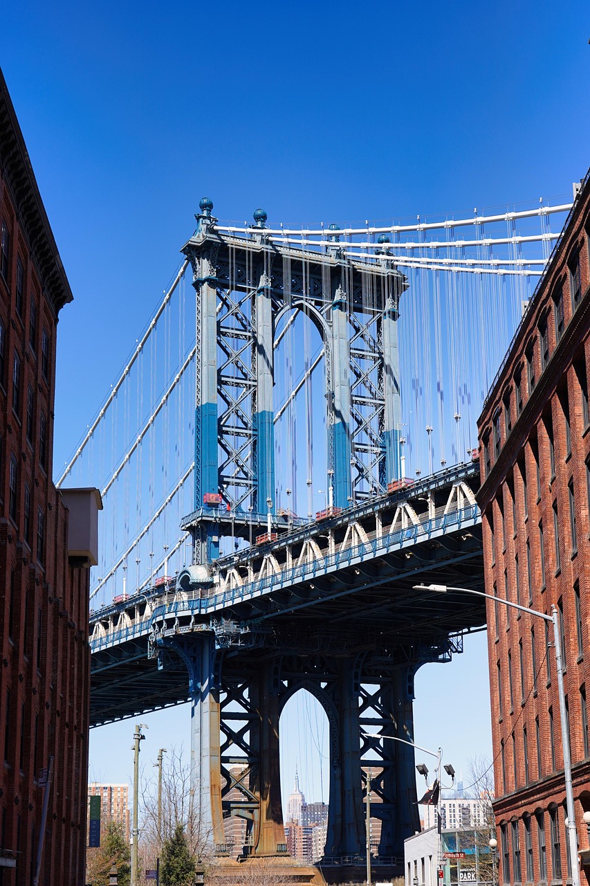
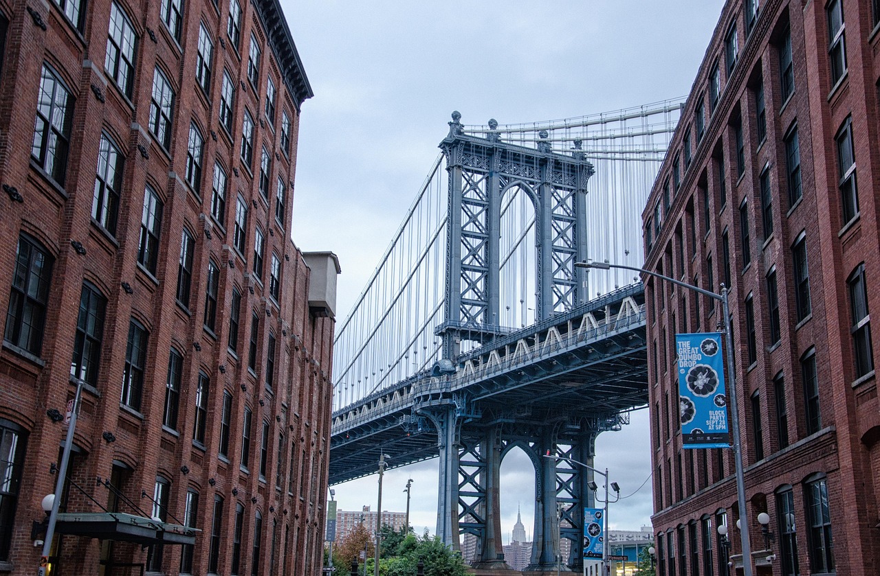
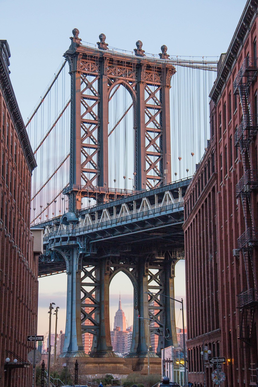
There you have it – the main differentiator is light and how you (instinctively) consumed it due to which parts of the frame were dark and which were highlighted. When looking at your own photos you’ll highly likely to notice the same exact pattern, where photos taken with bland or randomly positioned light feel like “just a snapshot” but the ones with more contrast (or specifically - luminance variation) stand out.
As mentioned - there is however the exception of your sunny outdoor photos section. The sun is quite a strong light source – therefore you instinctively neither stare at it (‘cause it hurts), nor take photos of people who stare at it (‘cause it hurts them). Due to this, most sunny photos end up having some sort of shadow on both people and background items as sun rays come from the side instead of directly in front or behind you.
To contrast this - in a bad, cloudy weather there is not much sun to be had, and if any light gets to you - it’s heavily diffused by clouds. In such circumstances no matter how you position yourself - the light will be pretty even across both your face and the background you stand against.
With indoor photography there is a different quirk. There might be some additional light sources in your scene, but usually they are weak enough that you don’t really have the same knee-jerk reaction as with the sun, so you often disregard their influence when taking a picture. Think - “I need to snap a quick pic of my makeup!” means probably “Going to the bathroom where a mirror is”. And what’s usually there? An overhead or over-the-mirror light source - which is an indoor equivalent of staring into the sun when taking a picture.
No matter which of the situations from the “worse” group we’re talking about – their problem is the same and it’s that the light is seemingly even across your subject (and possibly its background as well). This leads to the scene having no contrast, therefore:
- your eyes don’t immediately perceive the depth of the objects in the photo,
- nor does the pic itself feel interesting (it may even feel cluttered) as your eyes keep wandering across the picture with no concrete spots to latch on to.
“Depth? Interest? What are you talking about?”
Let’s tackle things one-by-one. For this, we also need to setup a “benchmark” for us to later compare to. Look at these two photos taken under your typical overhead light fixtures:
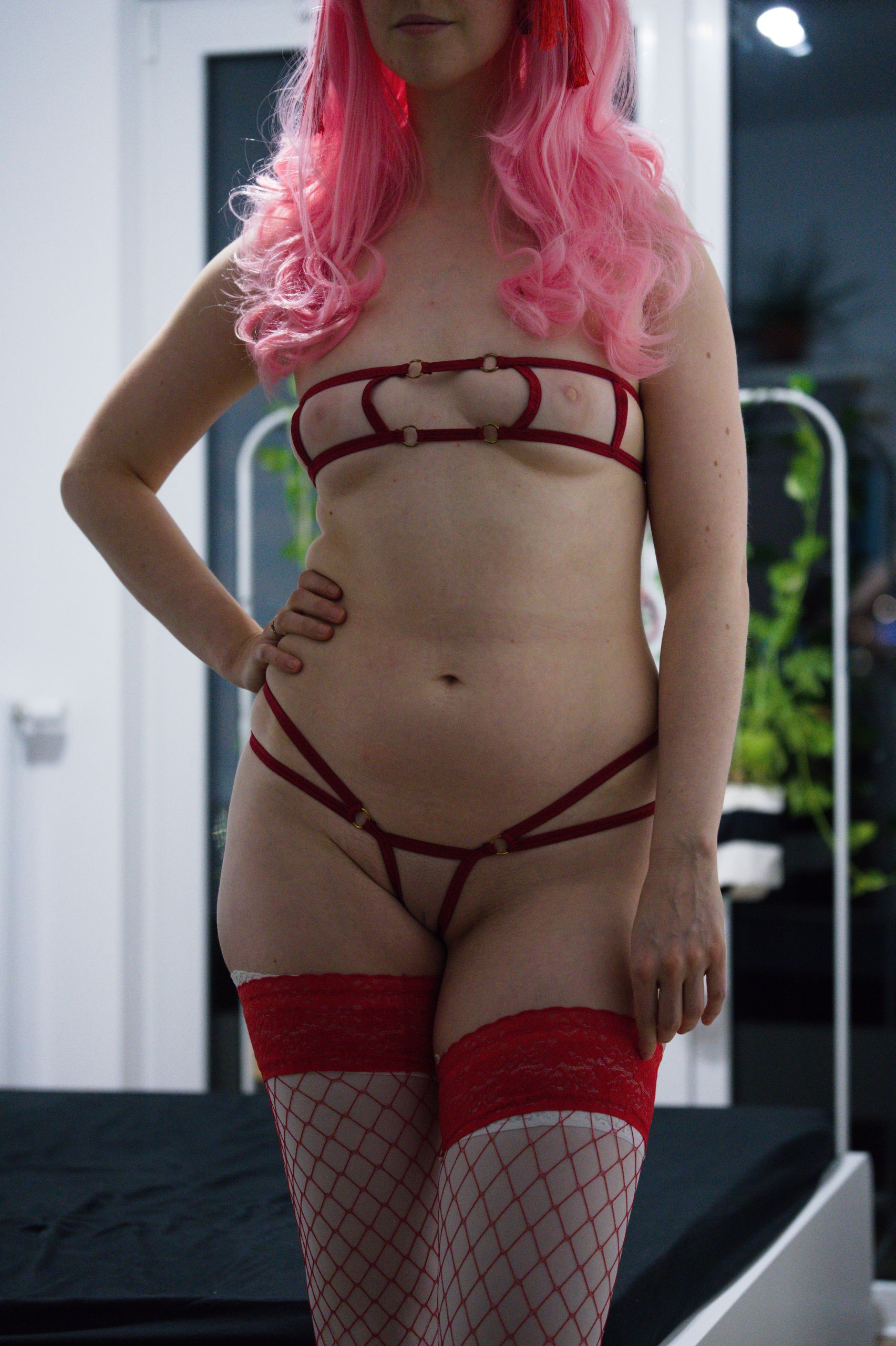
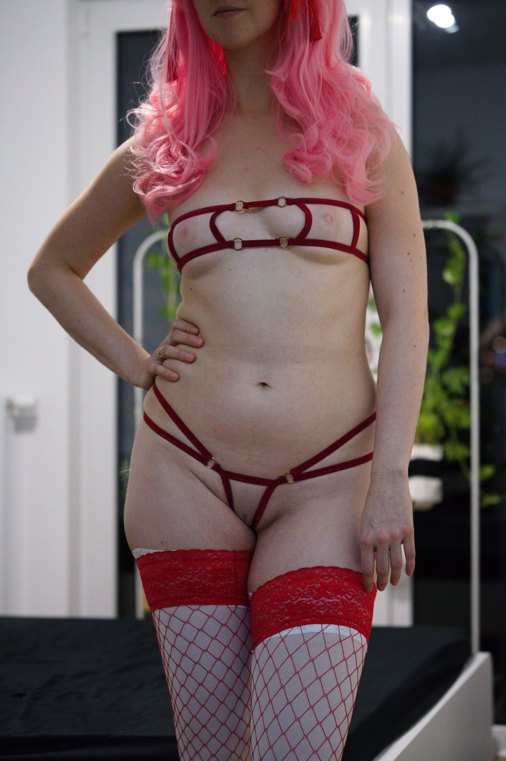
Depth – how light and shadows helps you see 3D in a 2D medium
Do you remember what a typical flash photo looks like? The one you perhaps took during a night out in a club to commemorate a get-together with friends? If you’ll look at it now you’ll probably notice that it’s essentially the “staring at the sun” example I brought up. Since the main light source – flash – and the camera are in the same exact place any detail on your friends’ faces is gone.
- That dimple your friend has when smiling? Gone.
- That cheekbone definition you have? Not there.
- Everybody’s nose? Feels almost translucent.
- The insides of the mouth and nostrils? Probably just as illuminated as the rest of the face.
- Everything feels weirdly… flat.
To see how exactly light makes or breaks a photo you can do a quick little experiment on your own. Go to the bathroom, turn on the overhead light and have a look at yourself in the mirror.
After that, switch off all the lights, close the bathroom door and turn on the flashlight in your phone.
Shine it on top of you, then move it to the side. You can also bring the phone to the front, as if you were taking a flash selfie.
What you’ll notice is that the more and more the light source was in line with the camera (or in your case - the mirror) the less you could decipher your facial or body features.However, you should also notice that at some point, when panning the phone to the side, there was a spot where light still illuminated both sides of your face, the shadow from the nose didn’t look comically long and your face had still highlighted protruding features like a cheek or a forehead. If you did - congratulations on getting an achievement Experiencing what Rembrandt lighting is all about (which is probably THE easiest cheat code to create a moody and professional-looking portrait photo).
After this short experiment you can now very quickly extrapolate what implications light will have on a person's body when having an erotic photoshoot. Depending on how the light is placed, where the camera is and what is the pose – one can highlight or hide body curves.
IRL consequences?
When we’re shooting together with Shizuka we sometimes joke that certain light angles make her bust appear twice as big since your brain usually makes associations like: Big shadow has to be cast by something proportionally big.
Similarly, you can create a sense of scale and depth when light hits only one side of the leg, thus creating a harsh shadow line going over a thigh which will in turn emphasise the chonkyness – something that exists in 3D but may be lost when shooting an inherently 2D photo.
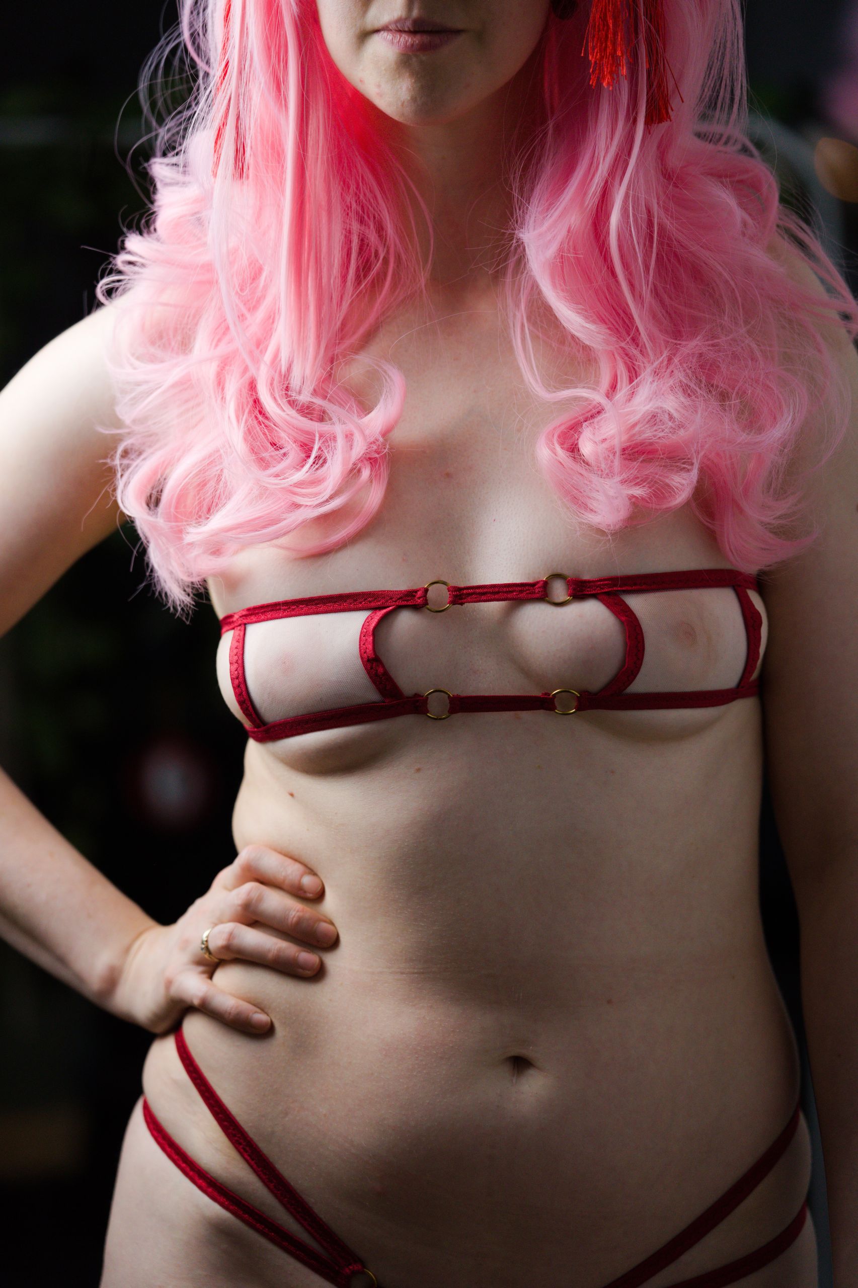
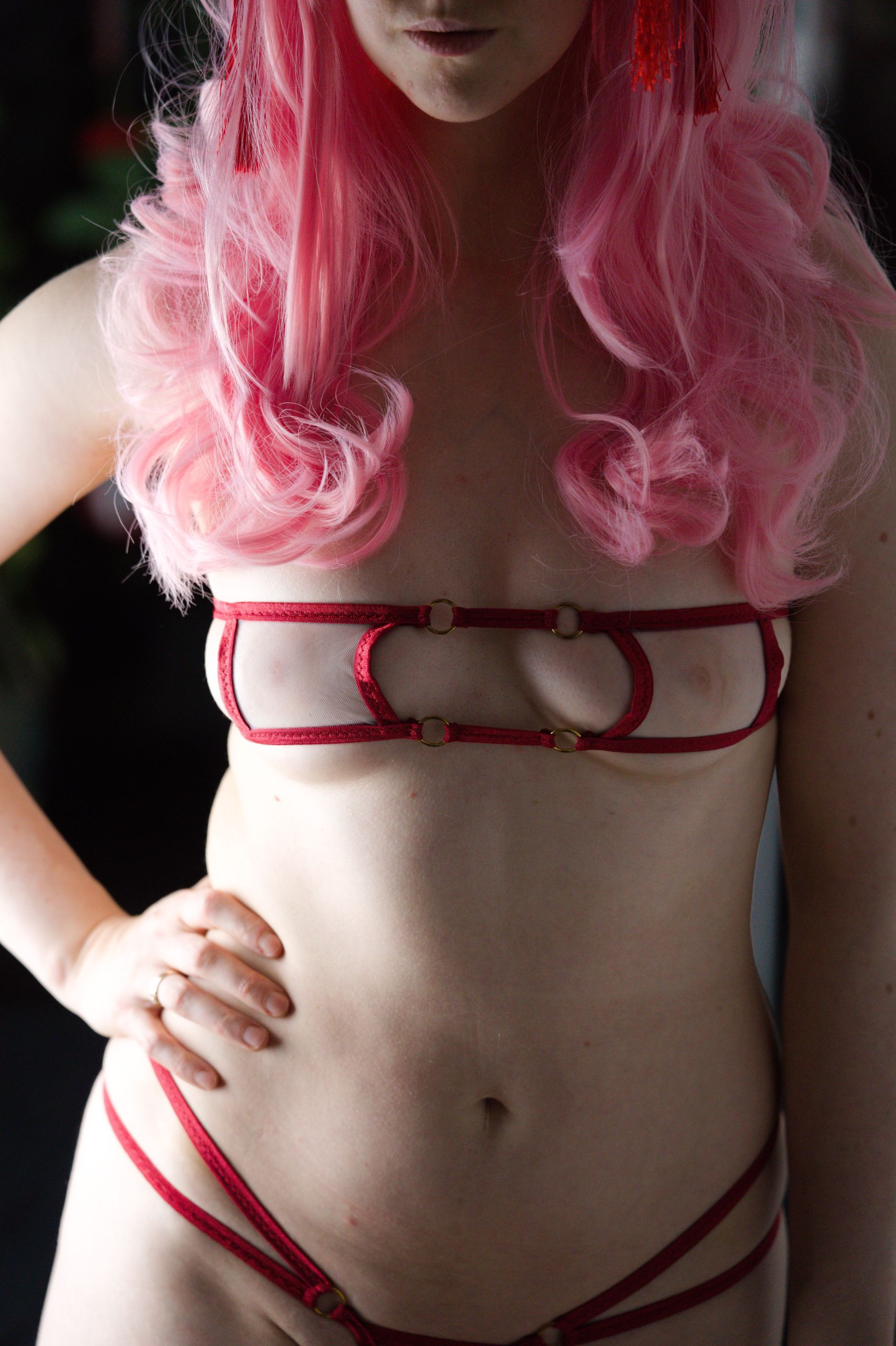
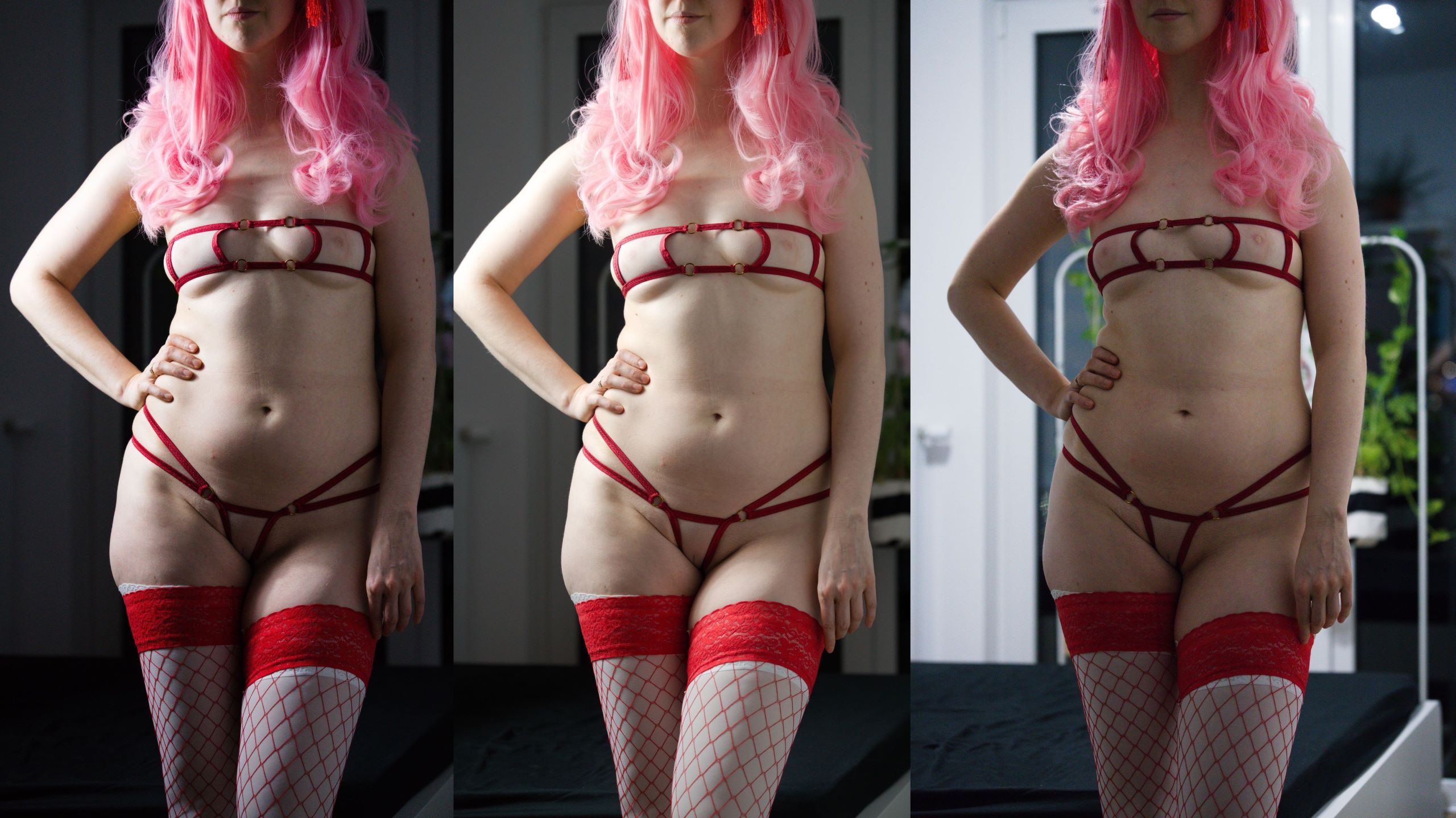
Here you can see some comparisons of what can (and most likely will) happen during a photoshoot - you notice lighting feels off, so you adjust it for a different result:
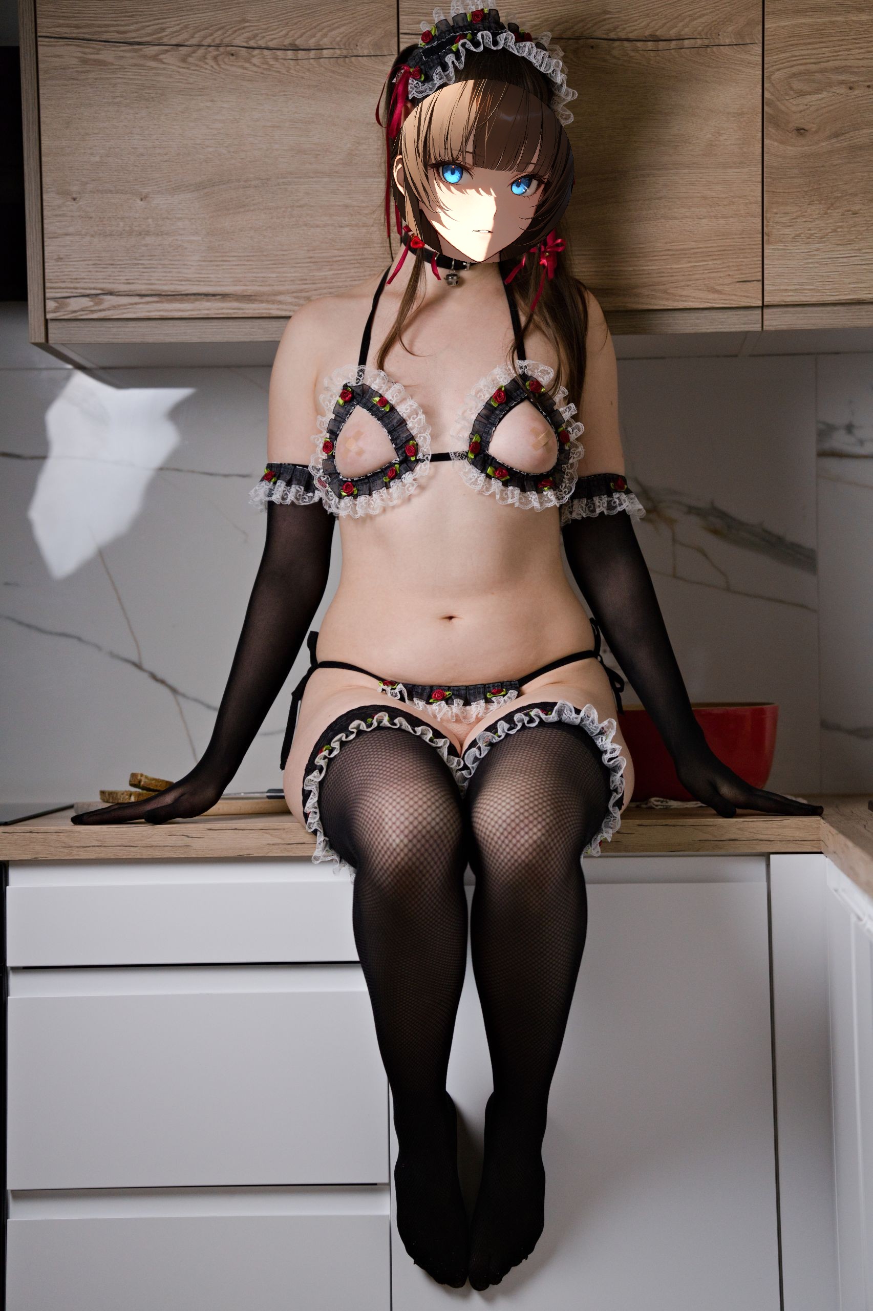
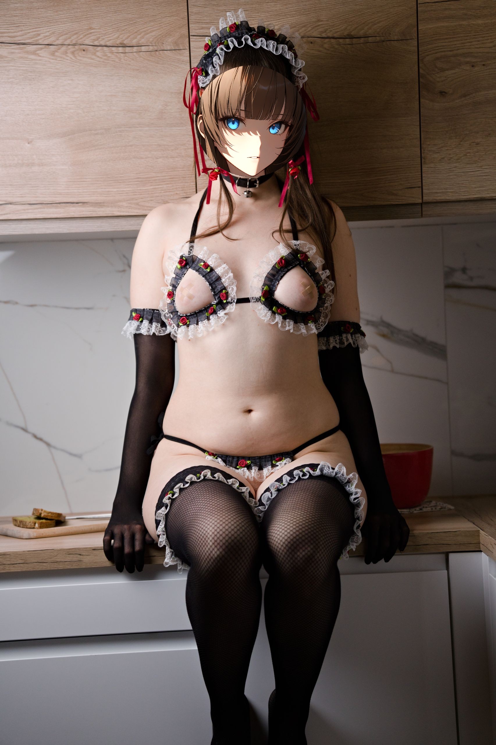
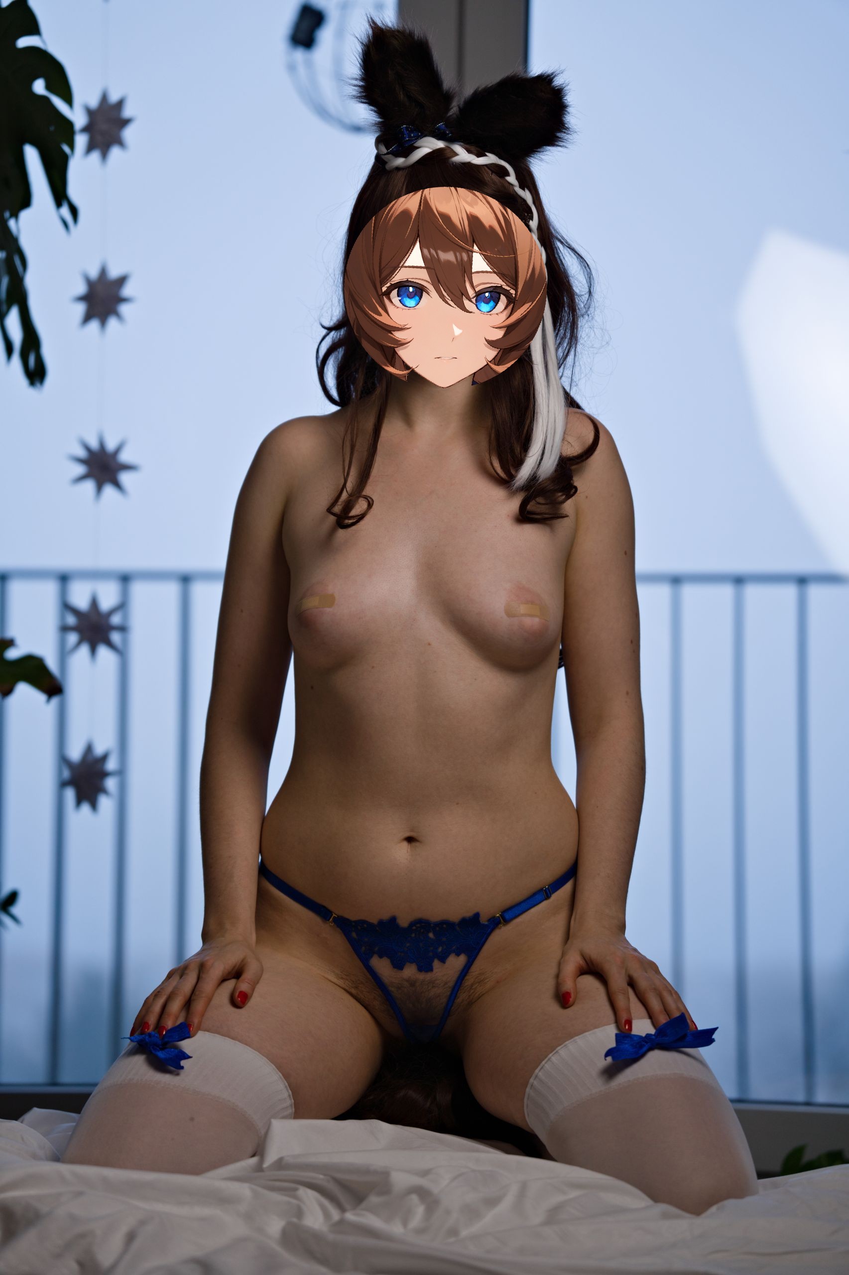
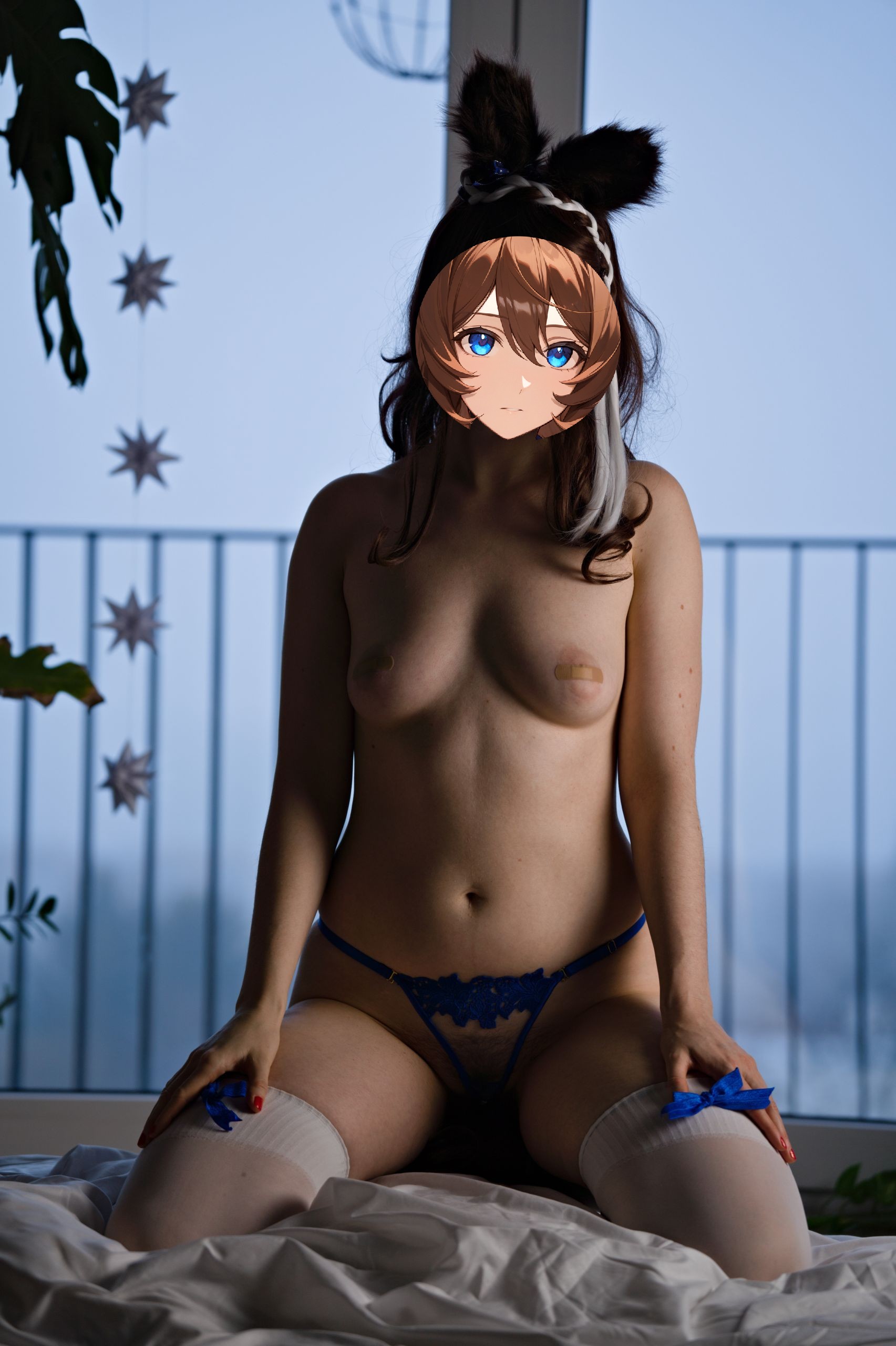
You can also see other creators having the same experience. Here’s the best example I’ve seen recently, from Siaoding Komachi’s photographer - Zell Ching:
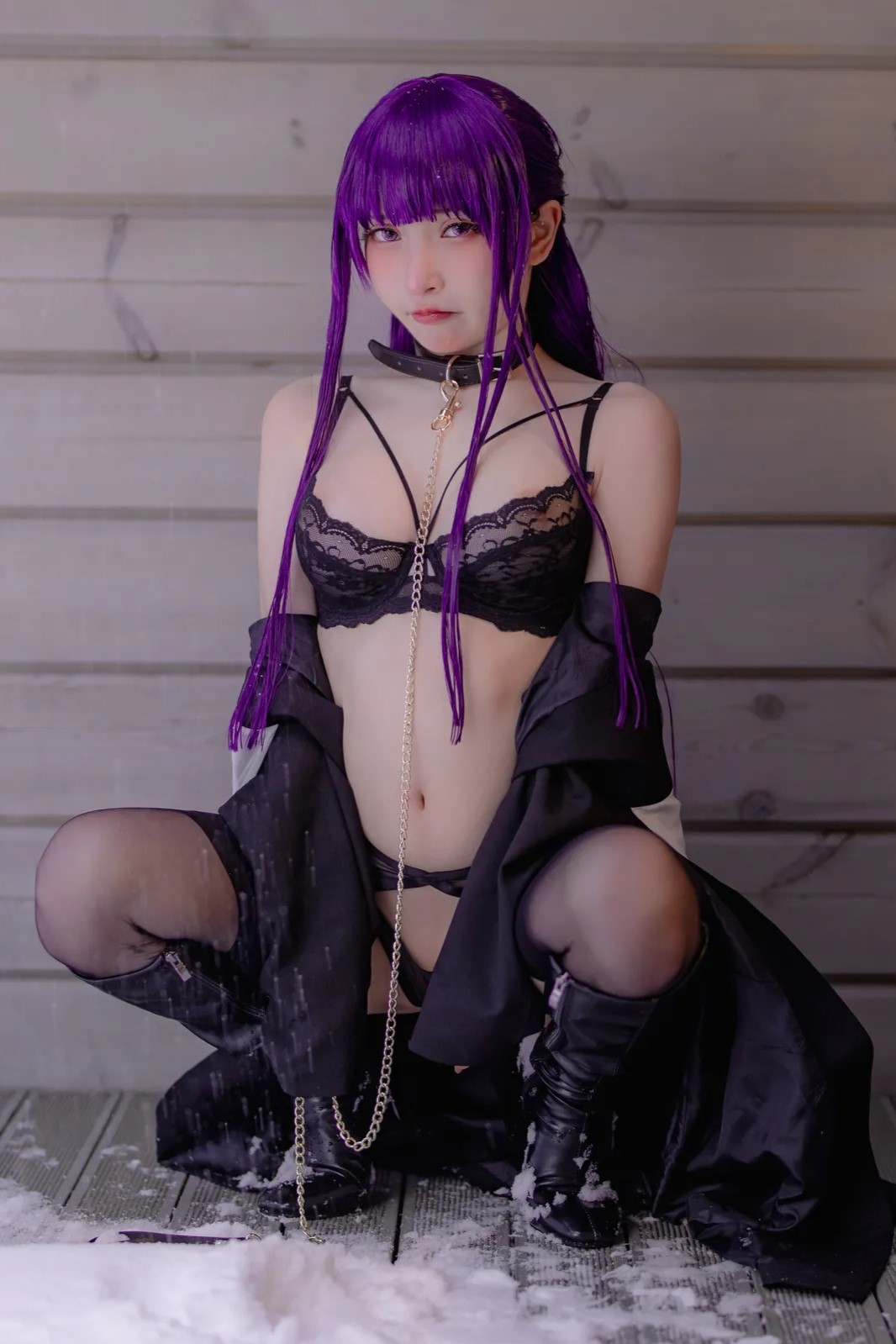
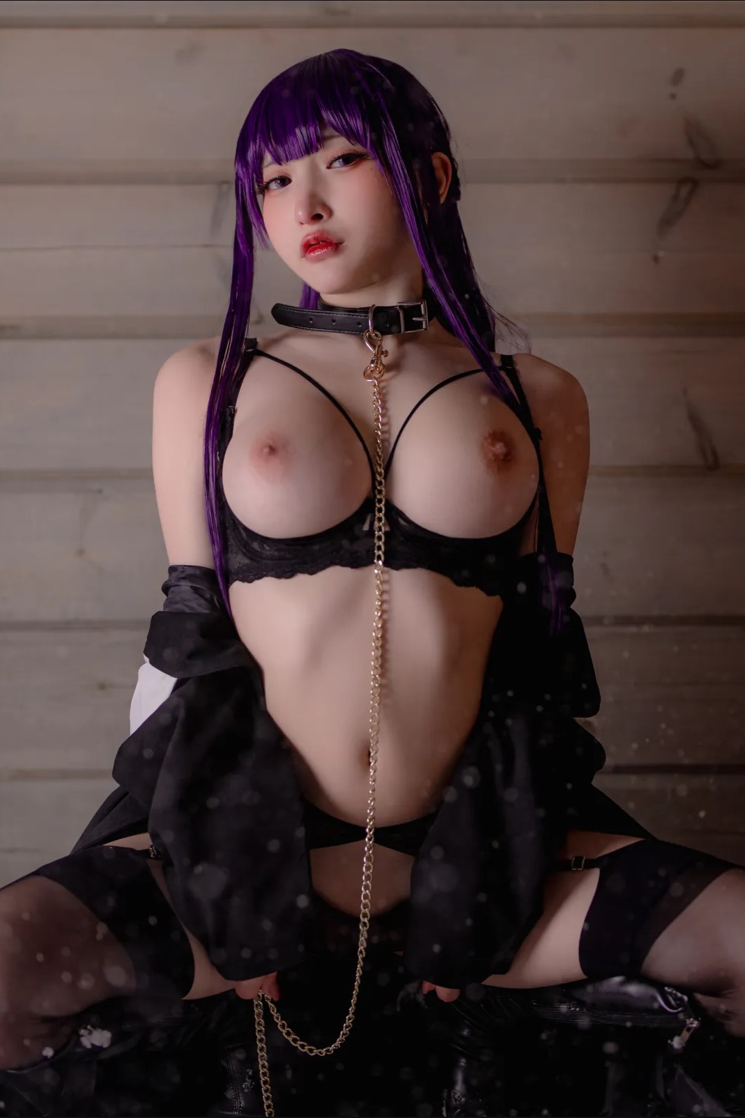
In all cases you can see that simply shifting the position of light can have quite the dramatic impact on the outcome.
That being said, since technically our rule of lighting can be summed up as “Don’t shoot directly with or against a light source.”, so sometimes all it takes is for the camera to move and angle, and suddenly the same exact pose and light placement makes much more sense:
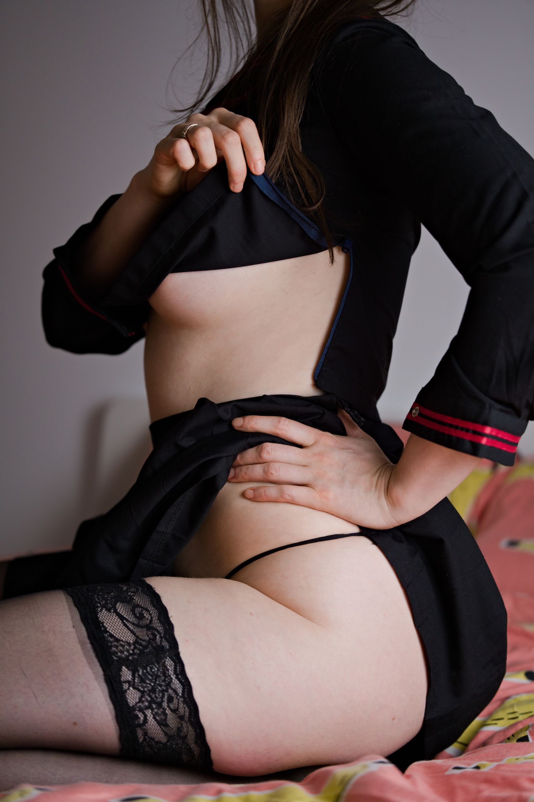
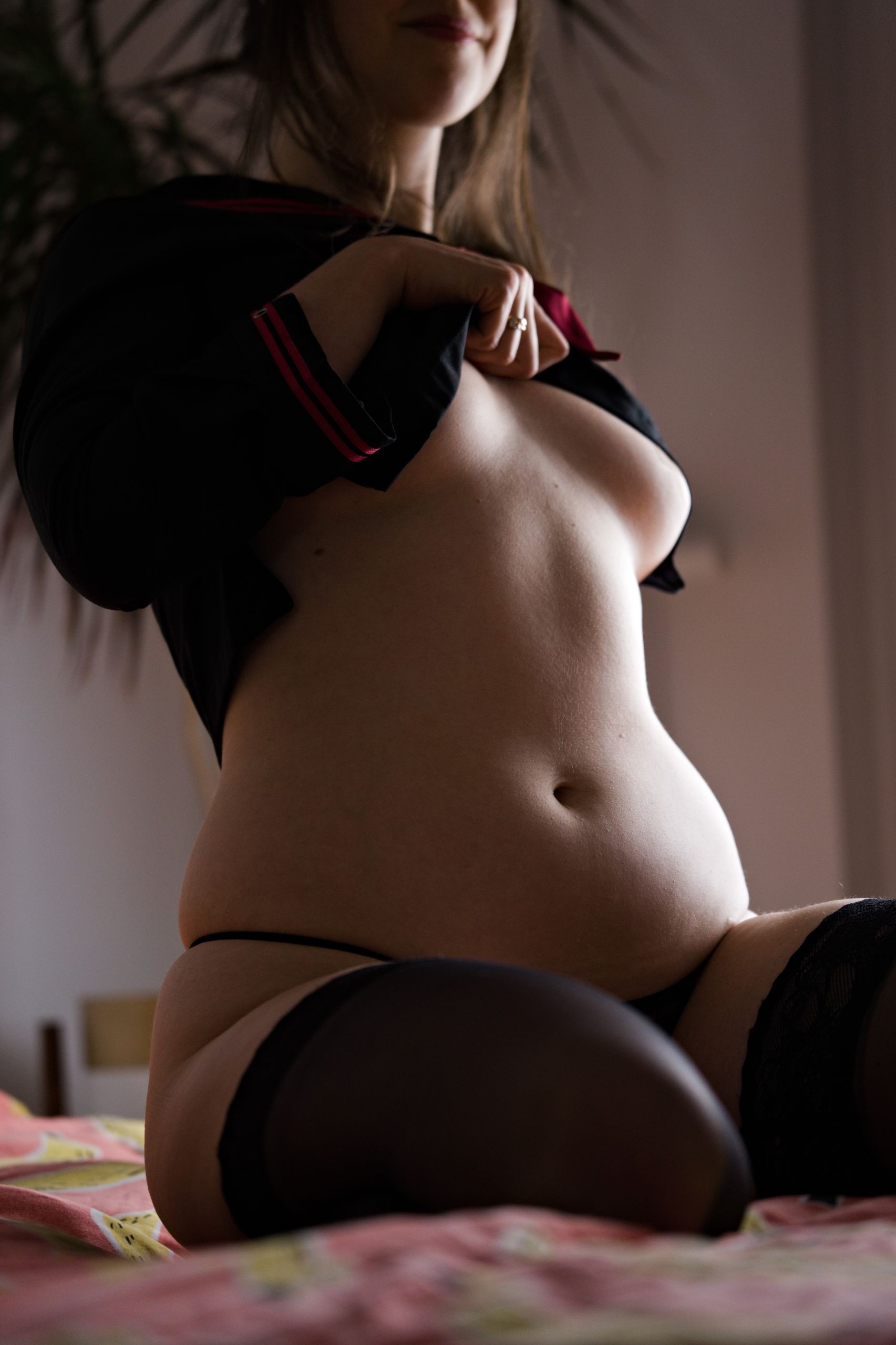
Such lighting principles of course work also outside of even portrait work – you can even hear from automotive YouTubers that car photoshoots are basically playing around with car vs light placement. No matter if you’re taking pictures outside and chasing the fleeting sunset or having an indoor showcase with perfectly controlled light sources.In all cases it will be “set up, shoot, reposition – rinse and repeat”… or if you prefer - “shoot around and find out”.
Interest – how light contrast can guide eyes to naturally go to a specific part of an image
Being in a perfect location to take a photo is in practice rarely ever true – there are often things in the way that you wouldn’t want to be included in the final photo. With the power of managing your light correctly you can work around imperfect setups by shifting viewer’s focus using (lack of) light to lessen importance of objects or even banish them from existence.
Just to double-confirm for you that there is a reason in this madness, consider again our Manhattan Bridge example. Every photo you’ve seen so far utilized framing or cropping in order not to show us a busy street down below with multiple cars. However the following picture easily gets away with it, simply due to them being mostly buried in shadows.
The easy solution – adding a bit of light
Whenever you’re browsing cosplay part of social media you’re bound to see cosplayers post pics of their newest outfit try-on, often with their clothing racks in the background. Just like before, you can segregate these types of pictures into two distinct categories – one where you didn’t even notice the rack and the other one where after 1 second the only thing you could focus on was the clothes hanging on it.
What’s the difference? Most likely it’s the light again – with the latter being shot during daylight with no additional light source or at night with some type of overhead flood lamp, either of which caused the whole room and the cosplayer themselves to be evenly illuminated.

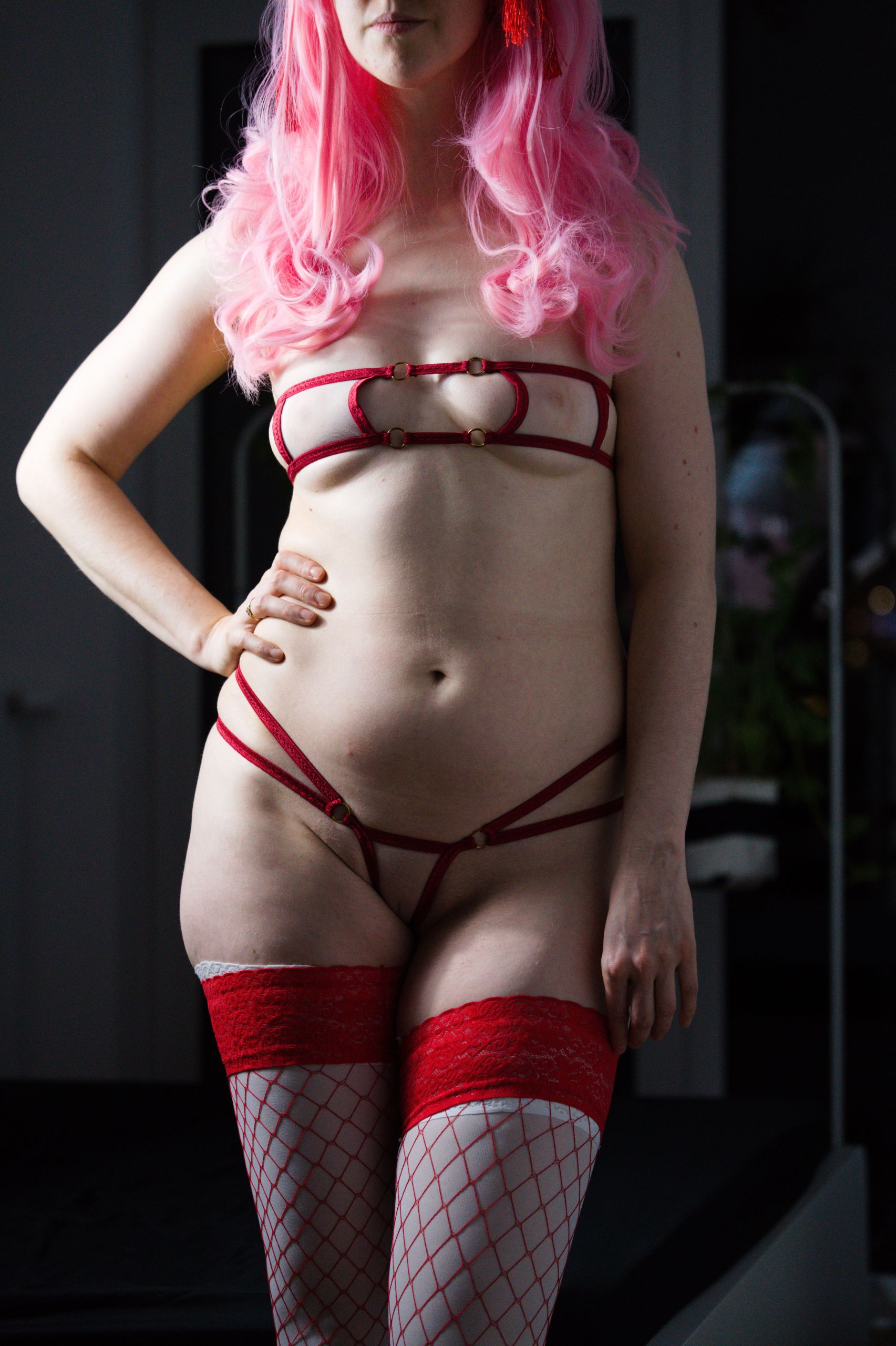
Just adding a bit of extra light onto your subject will greatly influence what will be noticed in the final photograph (or at the very least - in what order people are most likely to notice them).Just remember that this rule also applies in reverse - if you “accidentally” add light to a background object - you’re also going to make it stand out much more.
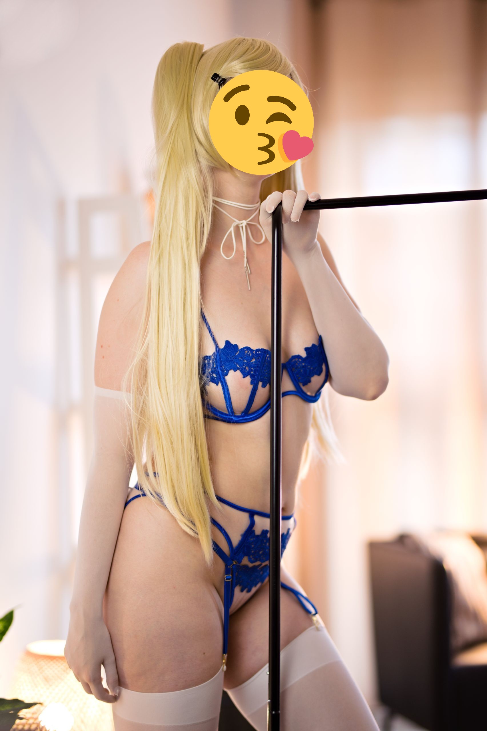
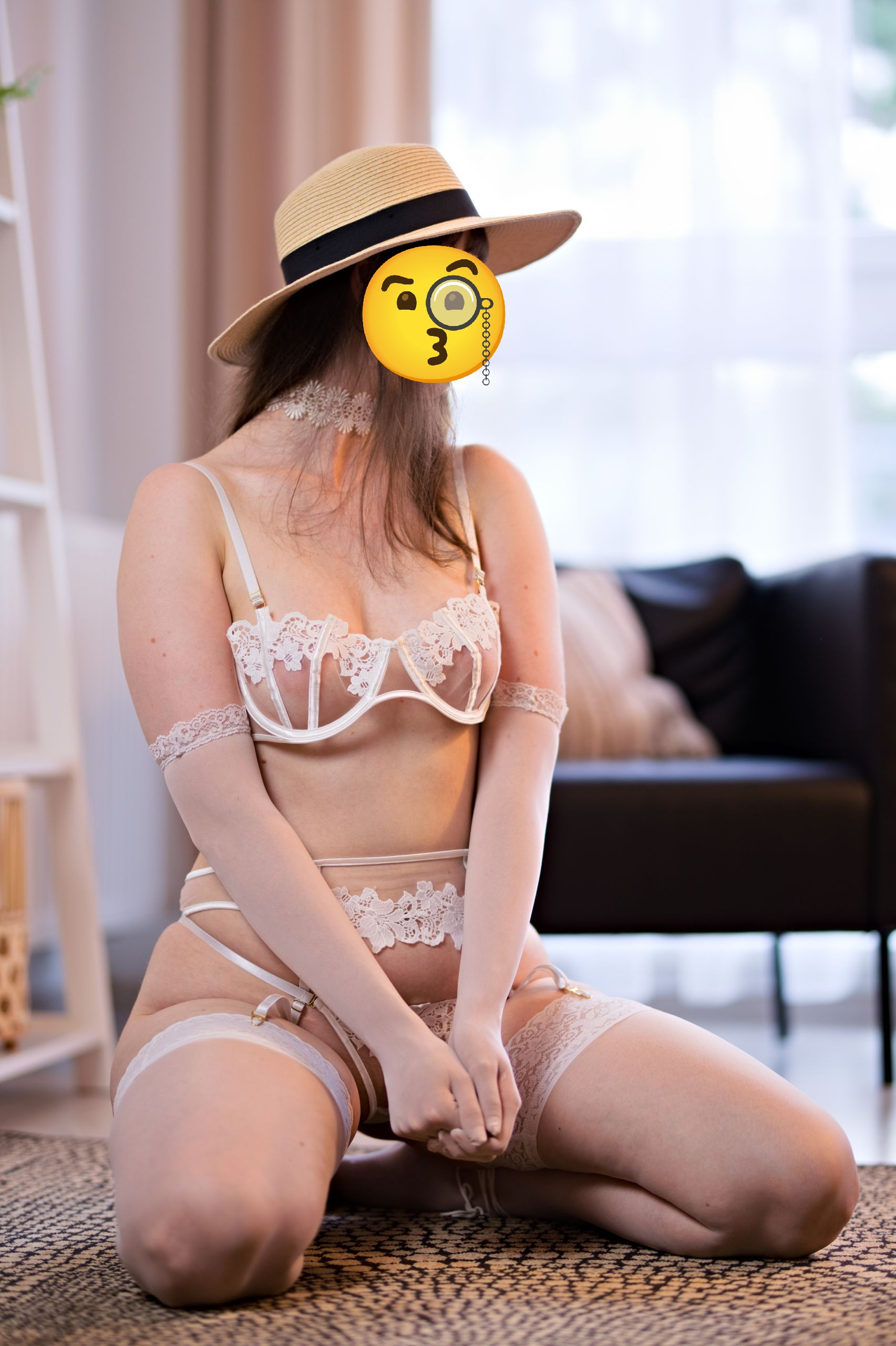
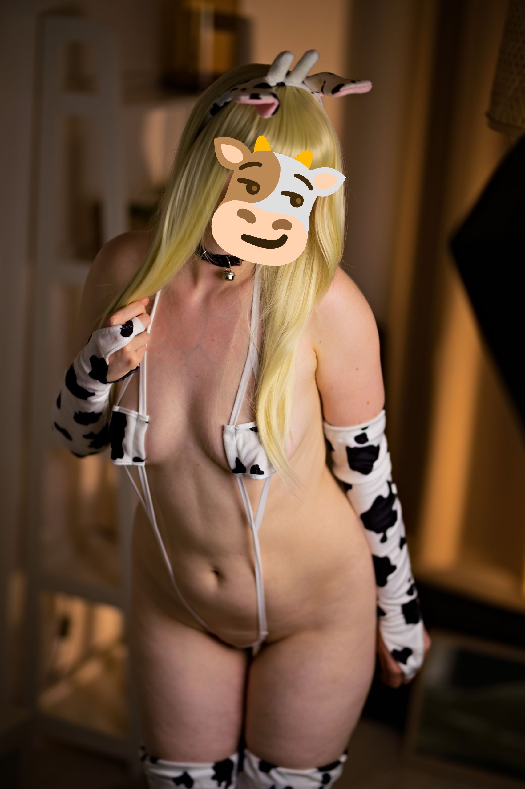
In general, this can be easily “fixed” if you adjust how much your light source is hooded. A big softbox will spill light everywhere, but a lamp stand with a deep dish that will closely envelop entire bulb will not:
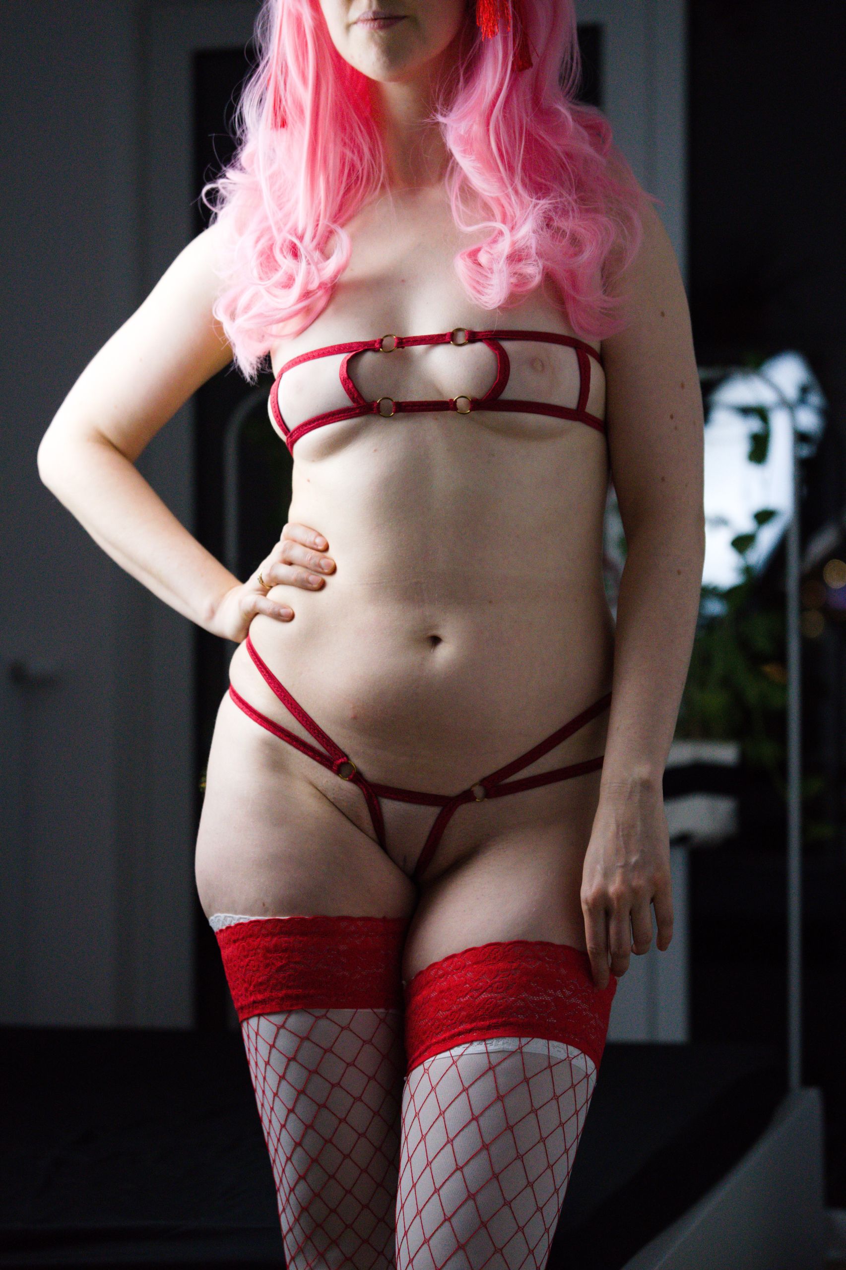
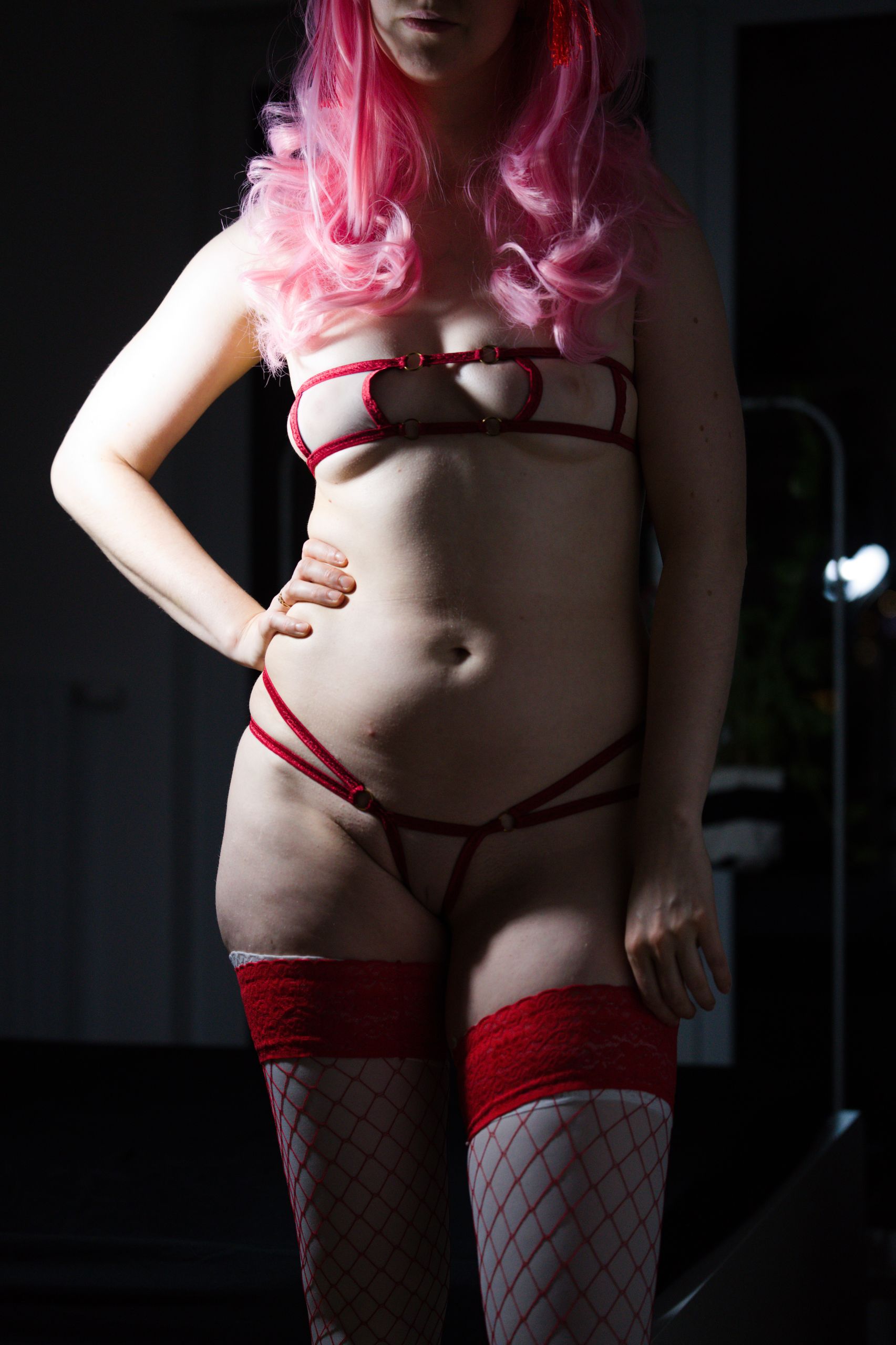
In case you ever wondered what changes in a photo if you just keep adding more and more light, here’s the answer as well:
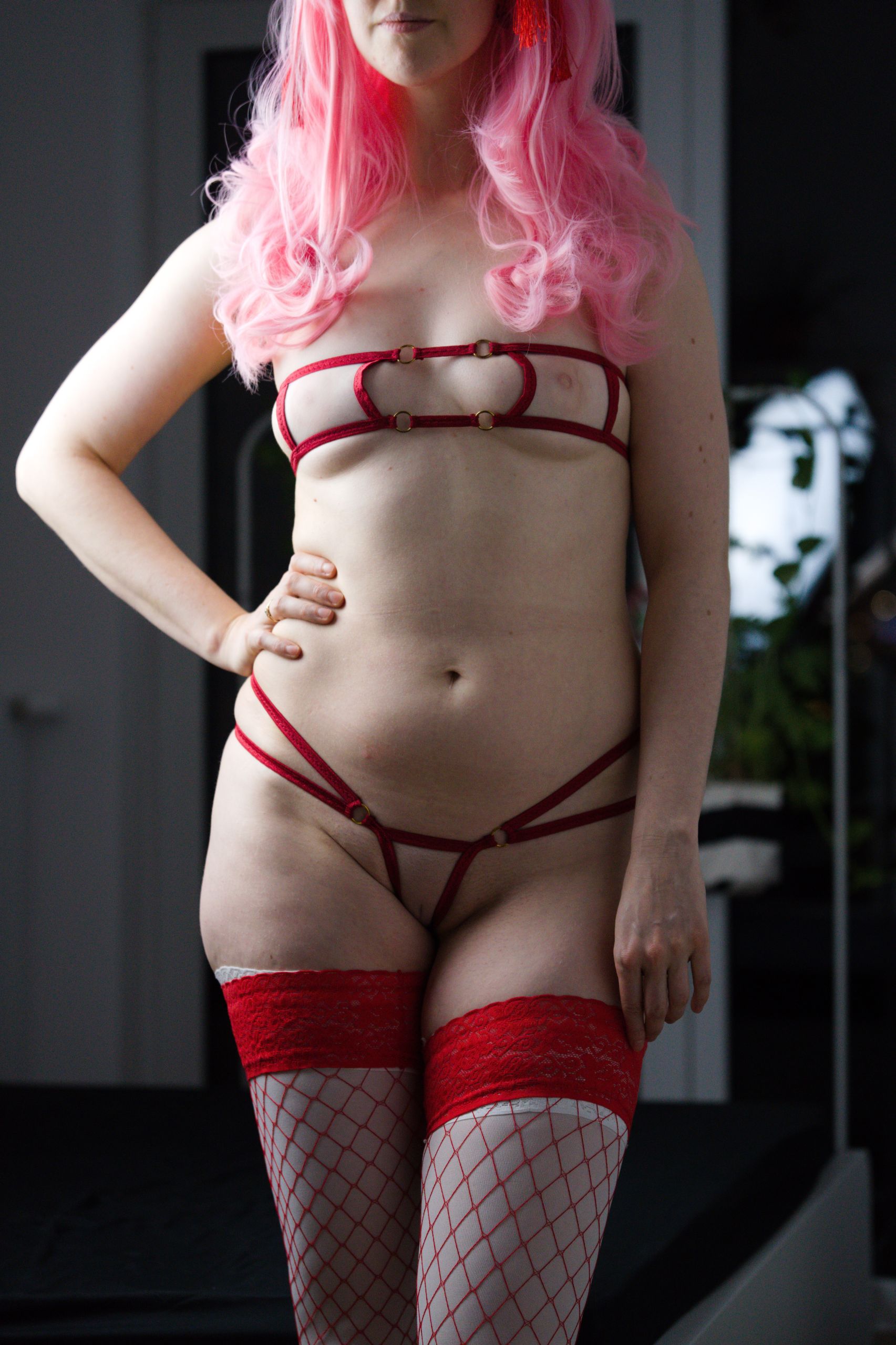
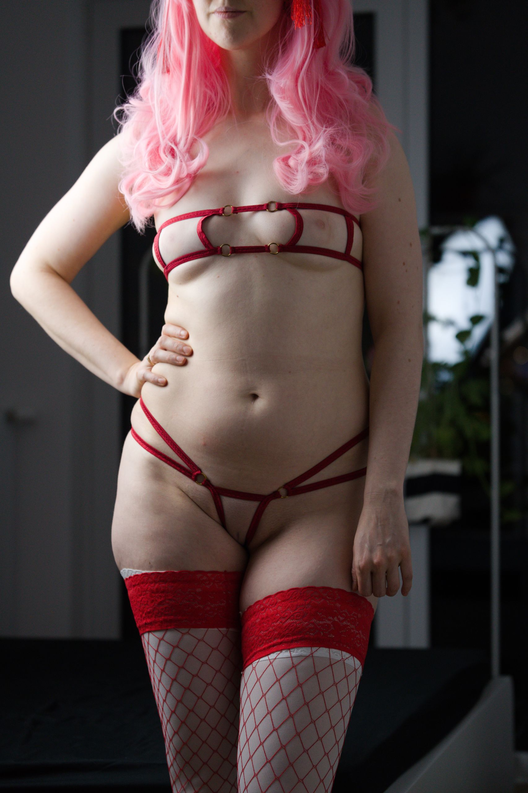
To me - the answer is not much, at least, in comparison to how drastic a change the angle makes.Sure, adding more light allows you to achieve higher shutter speeds without cranking the nasty ISO grain. Other than that though - you end up bleeding more and more light intro your background – and just because you can have brighter light source, doesn’t mean you should opt for it.
Just in case you’re curious, here is the same comparison of light intensity, just with a diffusion layer off, which will cause a little bit less of that unwanted light bleed, but instead may create irrecoverable white hotspots:
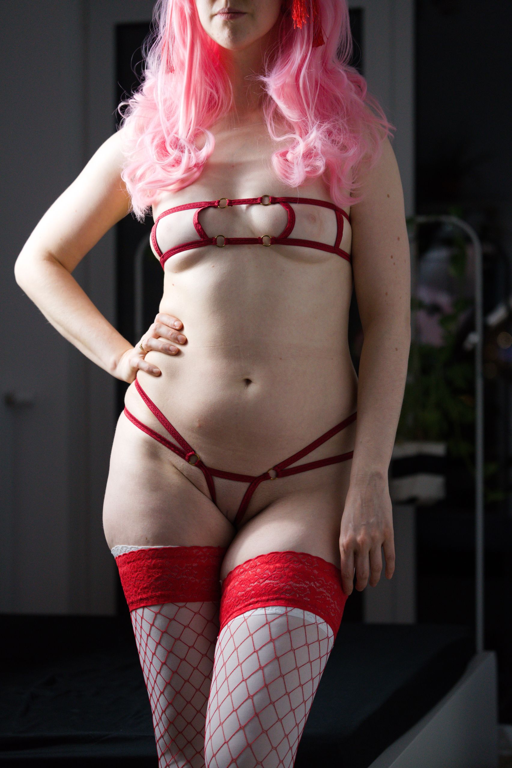
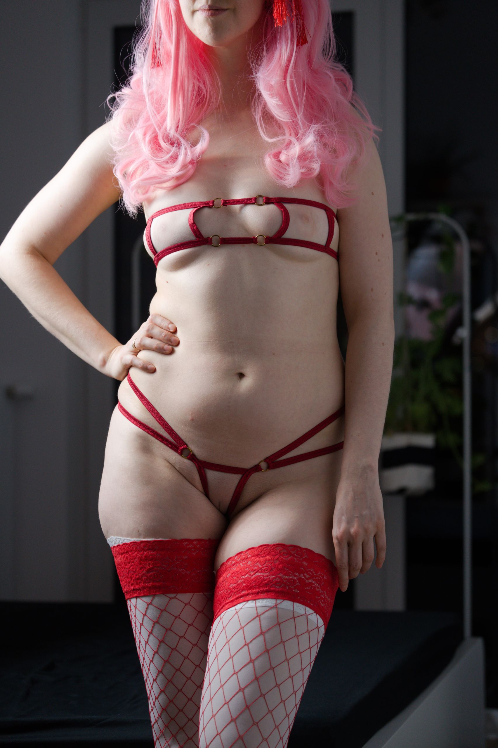
To understand why aforementioned hotspots can be an issue (and how following techniques we’re going to talk about work) - you need to understand how a digital camera interprets light.In short - a camera doesn’t see “a picture” - it sees a defined range of light intensity. Portions of a photo that are too bright will be interpreted as pure white and too dark will end up as pure black. Both of which will be irrecoverable, even in post production, leading to white or black splotches. The range of light the camera can capture effectively is so-called Dynamic Range, that’s calculated in steps.
For reference – typically cameras have anywhere from 11 to 14 stops of dynamic range, while a human is approximated to see 20 stops (where for us the most important conclusion being - the camera will interpret something in the scene as “pure white” or “pure black” already, while your eyes can still make out the detail in that spot).
The tricky one – purposefully overexpose background
Imagine a scene where you want to shoot with a window in the background on a sunny day but through the window you can only see some hideous buildings and you don’t want them to take away from the photo. Since for the purpose of creating an interesting photo we only care about the contrast of light, you can use the outside sun as a sort of “reference” and set up your indoor lights so that the camera sees anything outside the window as pure white.
In practice it is difficult to do due to a couple of implications like:
- in most cases you have to kill all the indoor lights > therefore you lose light contrast on your subject
- due to lack of amount of available light the photo is taken for a longer period of time (aka with slower shutter speed) > therefore if you move or have shaky hands the resulting image could also be fuzzy
It is however effective in at least keeping the busyness away in some parts of the picture.
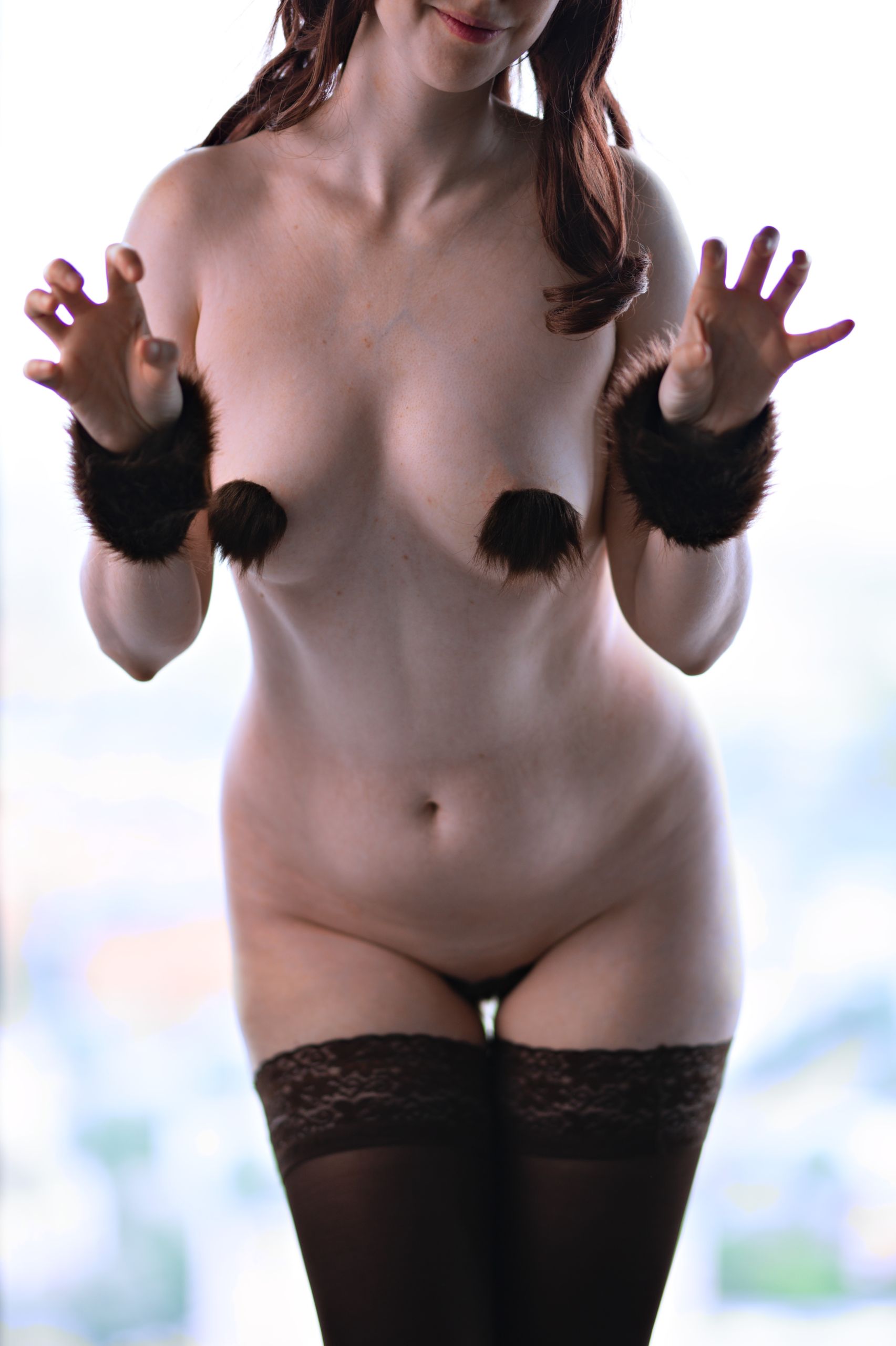
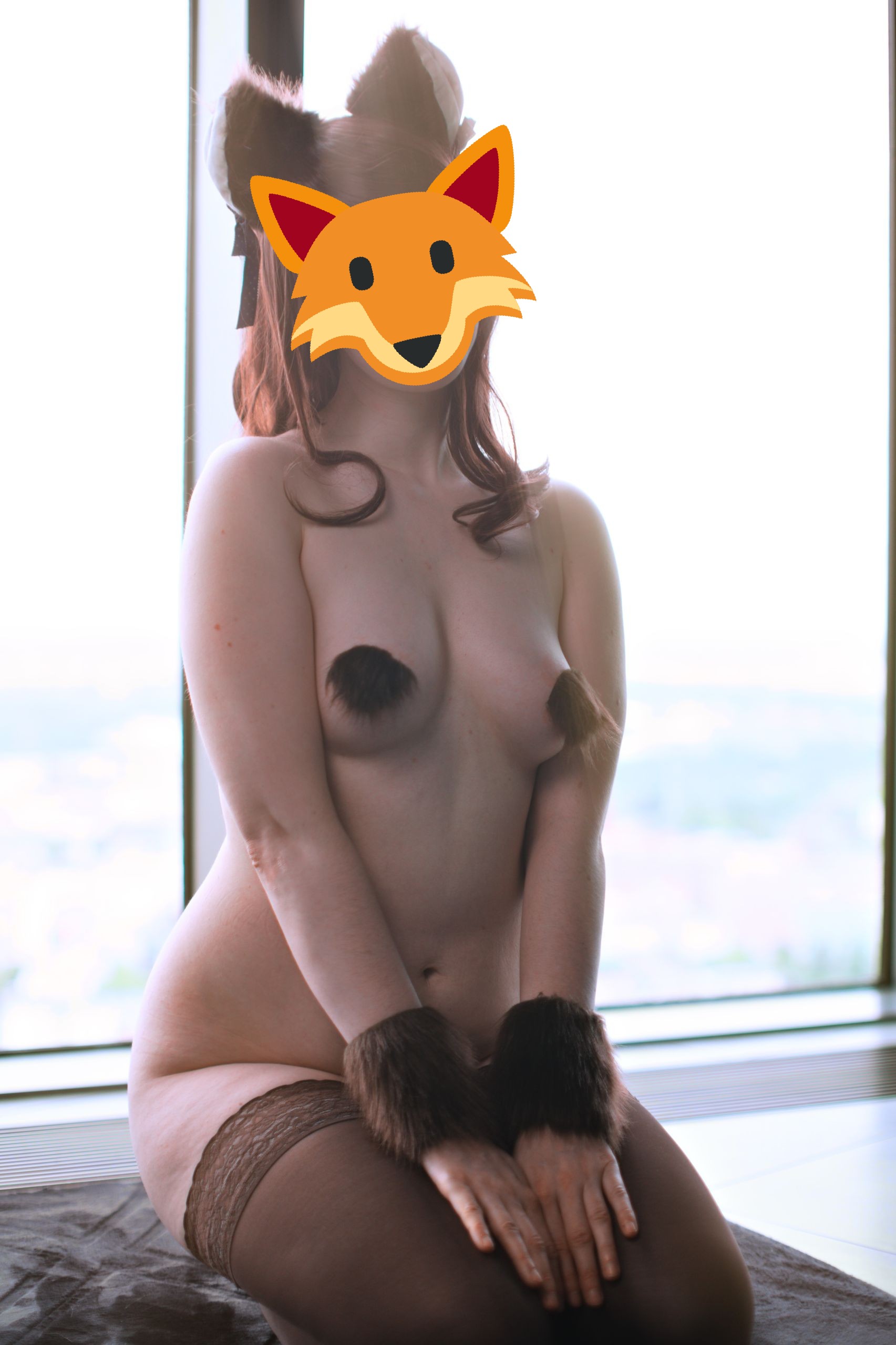
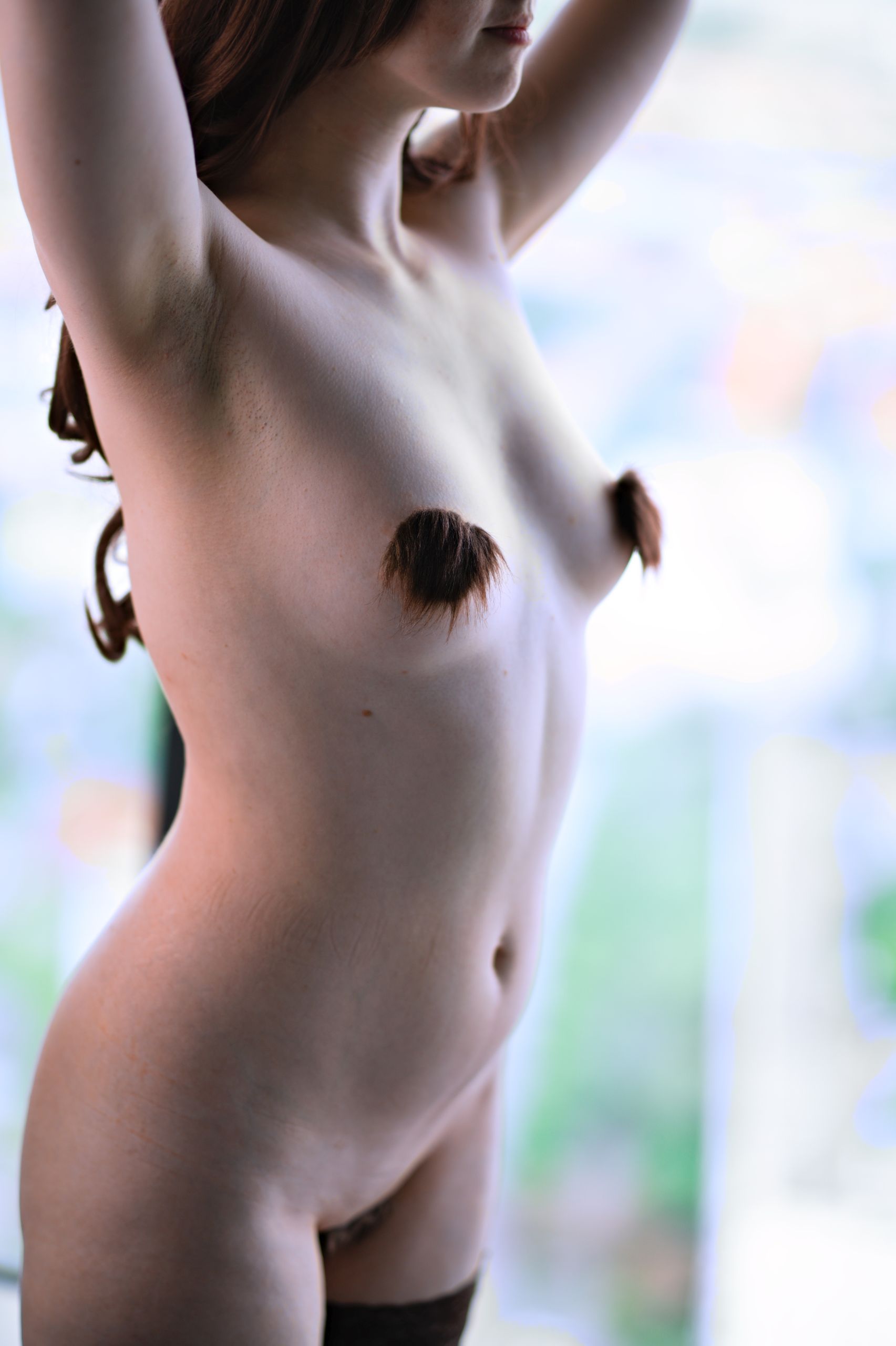
The hard one – underexpose background
You can also do an inverse of this technique and light up your subject with a strong enough light source that it overpowers your background’s available light, so that the camera will see it as dark or even pure black.
I deem it “hard” as you’ll often find yourself not 100% able to use it, unless having a specific gear or space:
- outside on a sunny, summer day – you need a really powerful source of artificial light to even match the sun, let alone overpower it but some pricey flash units are capable of it
- inside during the night – you will need a light fixture that will limit the light beam for the light to concentrate on your subject and not spill excessively onto the background, or find enough distance from your subject to the background for the light to shine only on what’s important
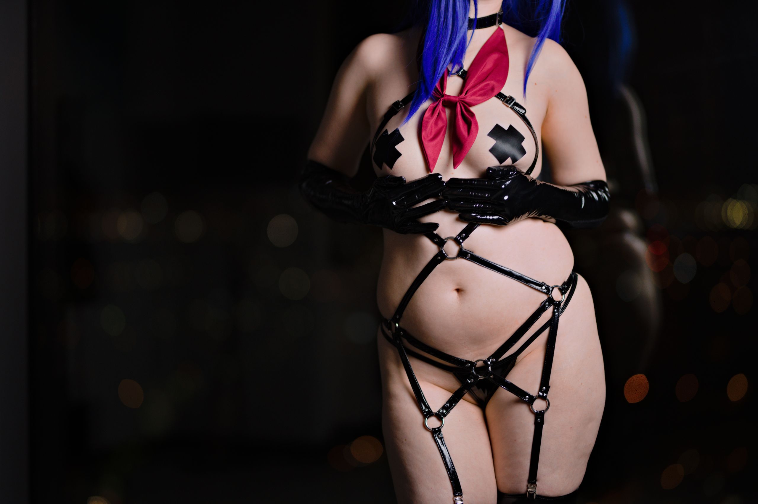
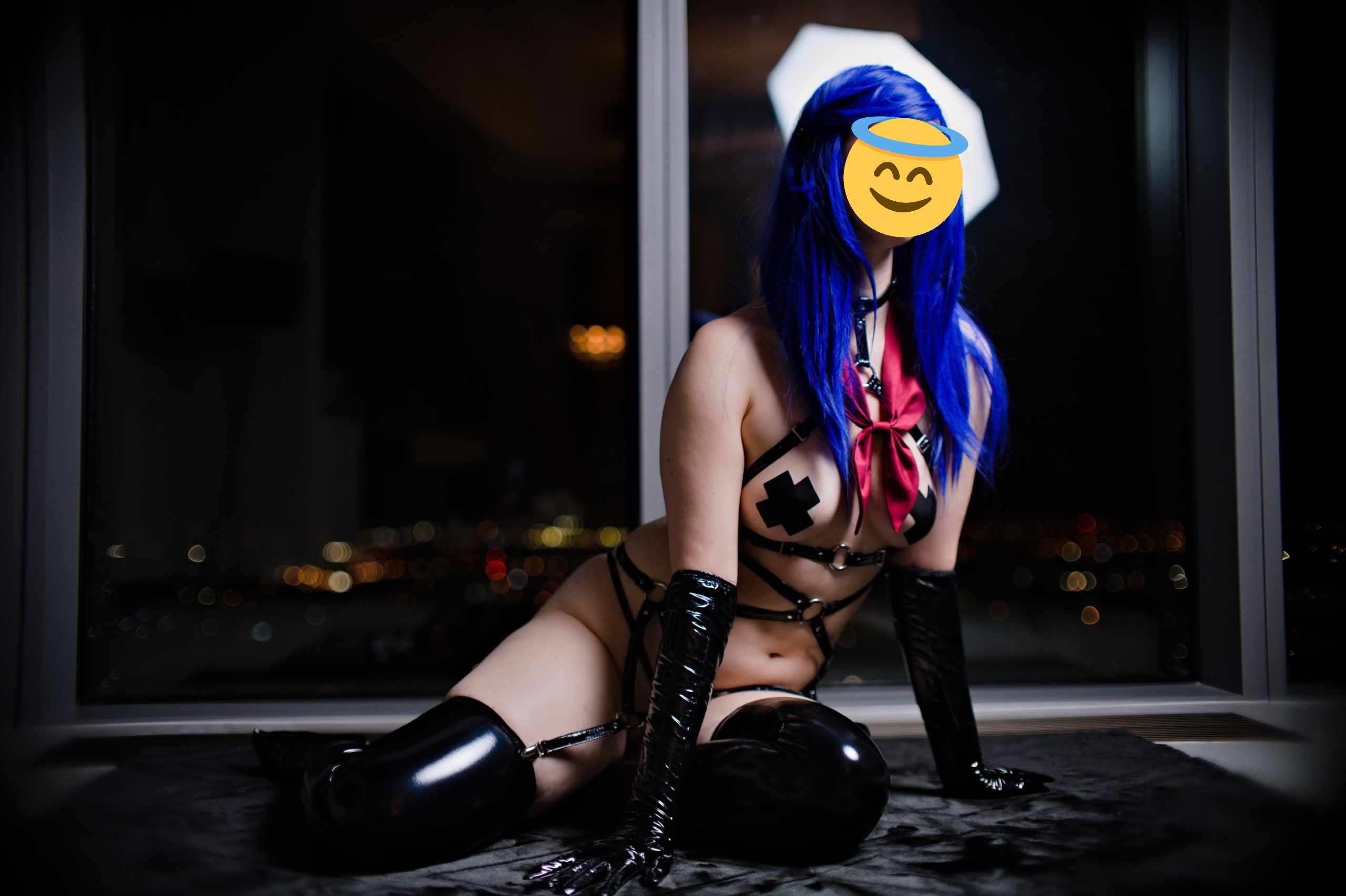
As you probably noticed – this is usually how we roll at Shizuka – with highly underexposed backgrounds.
What helps is that in the room-at-night example we often deliberately pick, the required “light fixture” to achieve the effect can be anything from a professional softbox to a literal Ikea lamp stand with a singular light bulb and some cardboard taped to it.
Summary: “Do you expect me then to always shoot photos with harsh shadows to have interesting contrast?”
In short – no.Everything I’ve mentioned should be used more as a tool - or perhaps a rulebook - on how your setup and decisions on set will affect your photo, not as a checklist.
With that knowledge in mind you can now experiment with different light setups, consciously making decisions on what and why you should change to achieve the desired look.
- Want to completely blackout the background?Make sure your light source is on your subject but not on the background.
- Want to soften the harsh shadow on the subject?Add another light from the other side, just maybe not of the same intensity.
- Want to add a halo around your subject?Add additional light directly behind them.
- Want to play with flash? You’re welcome! It’s just another light source.Just don’t point it head-on, straight from the camera. Instead point it to the left or right and bounce the light off the wall to make it indirect.
The world is your oyster so go out there and bring your own vision to life!